


Most IT organisations are under pressure to meet business needs better and increasingly need to deliver more while reducing costs. To help, HappySignals recently released The Global IT Experience Benchmark: H1/2022 Report, which includes a wealth of insights into the employee experience of various aspects of global IT service management (ITSM). It’s based on the operations of, and improvements made by, HappySignals customers. So, while the data and insights are helpful, an organisation that’s new to experience management needs to remember that these averages reflect a mix of experience management journey states – from the organisations just starting to those “a few years down the road”.
So, hopefully, you’ll click through to read the full report to see where other organisations are identifying issues and addressing improvement opportunities. If you’re unsure about what the report covers, here are three key employee experience insights from this latest data set.
How The Global IT Experience Benchmark Report is created
The Global IT Experience Benchmark: H1/2022 Report data is collected from HappySignals customers, including large enterprises and managed service providers (MSP) who use the HappySignals Platform with their customers. All the feedback responses are from IT end-users (employees) and reflect their feelings and perceptions about IT.
This latest report shows the findings and analysis based on 840k end-user experiences with IT.
Employee experience insight #1: Incident-related employee lost time is unevenly distributed
If you’ve read a management book, you might have encountered the Pareto Principle. This principle states that for many outcomes, roughly 80% of consequences come from 20% of causes (the “vital few”).
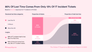
The Global IT Experience Benchmark: H1/2022 Report identified something similar for incident management – that 80% of the perceived employee lost time (caused by incidents) comes from only 13% of tickets (based on 433k pieces of feedback). The chart below shows not only this but also that 69% of tickets account for just 6% of perceived lost time.
This situation has changed slightly over time, as shown in the chart below.
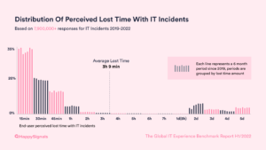
The Global IT Experience Benchmark: H1/2022 Report chart offers other interesting insights. For example, the high level of incidents with only 15, 30, or 45 minutes of lost time. So it’s also important to appreciate that the perceived lost time average doesn’t reflect the typical lost time. Or the growth in incidents that are perceived to incur two days of lost time and the polarisation of perceived lost time across the scale.
However, in interpreting this data, it’s important to understand that the way end-users report their lost time is on a non-linear scale that starts with greater granularity of choice. This scale can be experienced in this demo feedback form.
An interesting consideration of this polarisation is whether the experience data goes against the traditional incident priority and resolution-time matrices such as:
- P1 = 4 hours
- P2 = 8 hours (one day)
- P3 = 24 hours (three days)
- P4 = 40 hours (five days)
Resolution times might either well exceed these service-level targets (in the main) or fail to hit them, but perhaps few are close to the right side of the targets. However, the HappySignals insight relates to perceived lost time data rather than the logged resolution-time data. Nonetheless, it’s still worth checking via your ITSM tool and with end-users as to whether the agreed priority-based service levels are still relevant.
However, the big question is “Why?”, i.e. why the lost time feedback is distributed like this. Currently, we don’t know the answer and need to undertake more analysis. It could be that once a service-level target is breached, there’s no incentive for a service desk analyst to resolve that incident quickly. I’m told this is a little like the British late-running-train theory where an already-delayed train is delayed even further because on-time trains are given priority and allowed to pass it to ensure they aren’t late too. But right now, this is just a hypothesis that we need to investigate further.
Plus, this insight doesn’t differentiate the feedback based on incident priority. For example, understanding the percentage of P4 incidents resolved within an hour or P1 incidents that take longer than two days to resolve would add valuable insight (including to the causes of the above lost-time distribution).
So, what do you think are the likely causes of these extreme perceived delays in resolution? Please let me know.
Plus, is this view representative of your organisation’s incident backlog? Perhaps with delayed incidents waiting on problem management activity for a resolution or workaround.
Finally, do you currently have the capabilities to understand how your end-users lose time to incidents and in the IT support they receive? I’d be willing to bet that things differ from what your traditional IT service desk metrics tell you.
Employee experience insight #2: Employee remote-working experiences are improving
If, like many organisations, your Human Resources (HR) department elected to continue the opportunity for employees to work remotely post-pandemic, do you know how this impacts employees? Whether from an employee productivity or wellbeing perspective, or how IT service delivery and support capabilities are either helping or hindering employees as they work from anywhere.
At the outset of the pandemic, the HappySignals Platform added the ability for customers to gain insight into employees’ issues and experiences when working remotely. The H1/2022 feedback dataset offers valuable insights into the IT contribution to employee remote working – with this a high-scoring IT area (as shown below). Our customers have also increased employee happiness with remote working from +60 to +75 over the past year.
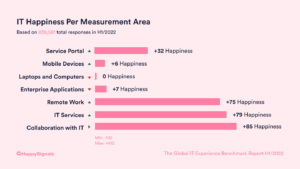
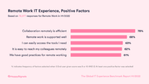
But the granular report data offers the most helpful insights – showing what’s working well, and not so well, for remote-working employees. It’s also indicative of what might be most important to them. The chart below shows the positive factors that influence good experiences.
While the next chart shows the negative factors that cause poor experiences.
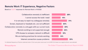
It’s interesting to see collaboration capabilities high in both lists. But it’s important to appreciate that there’s no one-size-fits-all approach to how IT teams can optimise remote working for their organisation’s employees.
The only way to find out is by collecting data directly from your own end-users. For example, employees may have different needs in different locations or work in areas where the internet access and cultural differences make remote work more or less challenging.
So, now that remote work is normalised in many regions, IT teams can use experience data to find pockets of improvement to optimise remote work for all employees and specific groupings with issues.
Employee experience insight #3: Geography is important with employee experience
The dangers of looking at averages in isolation highlighted earlier (with the perceived lost time data) can also be extended to demographic-based factors. For example, an organisation’s size and industry vertical. However, one of the most interesting insights relates to geography.
Previously, The Global IT Experience Benchmark Report showed analysis by country, but for the H1/2022 edition, we took a region-based view to highlight the differences (and feel free to contact me to access the country-based data and deltas).
As shown in the chart below, some regional differences are significant. For example, Western Europe has by far the lowest Happiness score. But, they also have the lowest level of perceived lost time (caused by IT incidents). Or when North America and Africa are compared, the Happiness scores are close – +77 and +78, respectively – but end-users in Africa perceive that they lose close to 2.5 hours more time than their North American peers (and are still slightly happier than their North American peers).
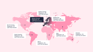
This chart (and the data that feeds it) highlights the impact of geography and culture on employee experience, which organisations need to bear in mind when aiming to improve their scores. For example, Western European organisations would struggle to get close to the Eastern European Happiness high of +87 from their current +71 score. Or viewed differently, an organisation in Brazil with a Happiness score of +79 might celebrate beating the global Happiness score of +77 until informed that the South American average is +85.
If you would like to understand more about The Global IT Experience Benchmark: H1/2022 or how experience management will help your IT organisation, please view the full report here.
By Sami Kallio, Happy Signals